|
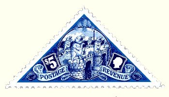
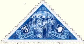
In late 2003 plans were afoot to release Discworld stamps to coincide with the release of Going Postal. Descriptions of the AMPO stamps were included in the text of the book, but Terry Pratchett wanted a special stamp created; something that he personally would give out, like a Blue Peter badge, to those who made big contributions to Discworld. There would only be a few; less than 20. Designer Colin Edwards and artist Alan Batley were given simple instructions; it was to be blue, and it was to be triangular. Terry had suggested the Brass Bridge as the subject, as it leads direct to the Patrician`s Palace (or cuts him off from the rest of the city with a clear view of whoever approaches). This was an excellent choice; it is Ankh-Morpork`s largest bridge, stone built, and is elegantly adorned with hippos. This stamp image is from the briefing papers housed in the British Library and contains the bare bones of the original idea. As I said in the The Briefing page I believe the bridge image has been overlaid on actual briefing image. This is an interim sketch done by Alan Batley a month or more after the briefing paper was issued. Ignoring the bridge then, you can see only a triangular shape and a $5 value were carried through to the Brass Bridge stamp we are familiar with. This stamp image is from the briefing papers housed in the British Library and contains the bare bones of the original idea. As I said in the The Briefing page I believe the bridge image has been overlaid on actual briefing image. This is an interim sketch done by Alan Batley a month or more after the briefing paper was issued. Ignoring the bridge then, you can see only a triangular shape and a $5 value were carried through to the Brass Bridge stamp we are familiar with.
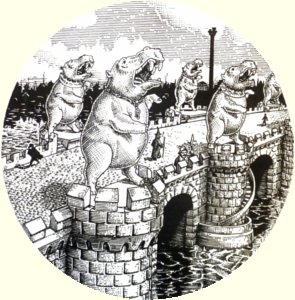
But the bridge is not explicitly described in the books. Should it be something grand and stylish like the Rialto Bridge, or more modest? Colin and Alan settled for an open bridge, somewhat medieval in style, where one could stand and look over the edge. But how many arches, how many hippos were there, and how were they positioned? The stories actually provide few clues, which gave Alan the chance to use both his imagination and perspective to produce a pleasing and balanced image. However we do know there were eight hippos, but you did not need to see that many in the stamp. It does seem logical that they would end up towering above the people, looking out towards the sea, and standing on the buttressed bridge supports.
click to enlarge
This image, from a postcard, is perhaps the best for detail of the stamp. Look at the skyline; the Tower of Art is obvious, but there is also a clacks tower and even smoke from a chimney. The focus is not only on the bridge but also the city itself. On the bridge are an assassin, a wizard, a small boy and a watchman with his halberd. There even seems to be something floating downstream (best not to ask what). The street surface is cobbled. It is a reasonable assumption that much of the inspiration for the drawing came from the Bishop Bridge in Norwich (pictured below). More famous old bridges with houses and shops, like the original London Bridge and Ponte Vecchio, would be echoed in the subsequent $5 Purple.

The British Library houses two printouts of Alan`s final artwork for the stamp. It is extremely detailed and amazingly, most of this is incorporated in the stamp. Several versions of this would have passed between Alan and Colin during the development of the stamp. Looking at one interim sketch you can see how much content and balance of the image was tweaked to bring it to life. Essentially the same view, but the hippos no longer stand at the same height and are separated from the TOA, they are opening their mouths and baring their teeth, and cobbles and additional characters are added. What I am surprised by is that Alan has always done it circular. If the picture had been wider and the corners filled in it could have been moved a bit this way or that to get it right. Alan was obviously confident that it was right. Click for larger images.
interim sketch final drawing
In Feet of Clay it states that one night Vimes is on the bridge, he strikes a match on a golem`s toe, and the light reveals a piece of grafitti saying Zaz is a Wonker on the stonework. I have heard that Terry was keen for this to be included if possible. But, to be where Vimes reads it, and actually to be able to read it on the stamp, would mean a close up drawing and not much of the bridge could be included; so that proposal was dropped.
Incorporating that illustration into a triangular stamp where all the elements come together needed a skillful designer - Colin. Placing the illustration centrally left a lot of space and awkward corners to fill. An easier option, that does not always work, is to fill the space with the illustration. That would have lost much of the skyline, an essential element, due to the triangular shape. However, the spaces can be used to good effect. The olde worlde nature was accentuated by the use of shields to display Vetinari`s bust and the $5. The shields also hint at grandness and nobility, and this feel is supplemented by the scrolly bits. Terry wanted the pineapples in the top corner as they are a symbol of wealth and prosperity - in the 17th century if you threw a grand banquet and wanted to flaunt your wealth you could hire a pineapples as a centrepiece for 300 quid each at todays prices. That left the two bottom corners which incorporated cabbages (what else you may ask) into the design.
There is one element left, and one not often noticed. All these elements are not placed on a flat background. There is a complex swirly design there, somewhat like a banknote, recognizing that a high value stamp like this would often be used in lieu of currency in the city.
The pure blue chosen (some of those shades contain no red or green; just blue) and the high contrast between the shades gives the stamp a rich and vibrant look. Officially it is empire blue, with octarine tints. Whatever, there is nothing insipid, or muted. It is the flagship stamp for a prosperous city. Vetinari would have approved.
I have read (too often) that this stamp was inspired by the Cape of Good Hope 4d triangular, which was also blue. The shape and colour (sort of) match but nothing else does. That stamp has the text in borders along all three sides with an image and background filling the space inside. The CoGH stamp may have provided the germ of an idea, but beyond blue and triangular has little in common with the $5 Blue. Another Cinderella stamp shares a lot more with the CoGH 4d. Unlike the Tower of Art $1 (and other stamps) there was no RW stamps elements used in the design.

The link between the Blue Triangles and the Cape of Good Hope stamps is more than likely to be a retrospective association, designed to emphasize the rarity of the stamp. The origin of this may lie in an article in issue #1 of the Stanley Howler Stamp Journal drawing comparison between this stamp and the other blue triangle. The CoGH 1853 4d (the first stamp issued on that continent) is reckoned to be one of the world`s rarest with one example selling for in excess of US$40,000. Remember that this stamp was originally going to be awarded by Terry at his own discretion, so this linkage would have only applied and been valid after the change of policy and the stamps were designed, printed, perforated and distributed to collectors.
|